Our Covid-19 tracking data feature proved there is real demand for datavisualisation in Hungary

When we launched the Koronamonitor, our Covid-19 tracking data feature on 13th March, we expected that we will have to update the site’s graphs and data only once daily, and this will take no more than 20 minutes work a day. During the first week after the launch did not happen any extraordinary, except that pro-government propaganda news site Pesti Srácok attempted to discredit out project. Then after a report by news television ATV on 20th March the site exploded, we received enormous amount of users, page impressions, e-mails, comments and calls.

The success of the site can be measured not only by users: more than 1 million page impressions and more than 8000 Facebook-shares (also by politicians, researchers, and doctors) in 3 months. More importantly most of our readers used our site not paralel with the official governmental coronavirus news site, but as the only authentic source of data on the Covid-19 pandemic in Hungary. This brought some misunderstanding.
Many readers thought that we had more data and information than what the Hungarian government disclosed with the public. Others presumed that we were hiding some elemental data. An example for the scarcity of information from official sources is that many readers asked for more and more graphs, calculations, statistics. We received a request from a Hungarian hospital asking us to calculate an estimated number of free bed capacity needed based on their daily new cases.
Coronamonitor: we publish daily stats and visualisations on the virus outbreak in Hungary
Data journalism section Atlo of Atlatszo launched a subpage dedicated to daily statistical updates, graphs and maps of the current status of the coronavirus outbreak in Hungary.
As the Koronamonitor was becoming and institution (and we truly believe that this is what happened), it had to fulfil a series of requirements, and these requirements were set up by our readers. We share some takeaways below:
- Processing and sharing large amount of data and making graphs out of them is not enough. We could react to the news and inquiries relatively rapidly. But was also equally important that the site was designed conceptually and aesthetically, which gave to the project authenticity, uniqueness, trustworthy, and clarity. We also drew attention to the methodology, the limits of data, we indicated the uncertainty, the lack of information, and we shared scientific papers and articles on methodology, dilemmas, pitfalls and design choices. Naturally we wanted that our readers to trust our site, that’s why we read dozens of theoretical and practical articles and journal papers from methodology to the ethics of data processing and visualization.
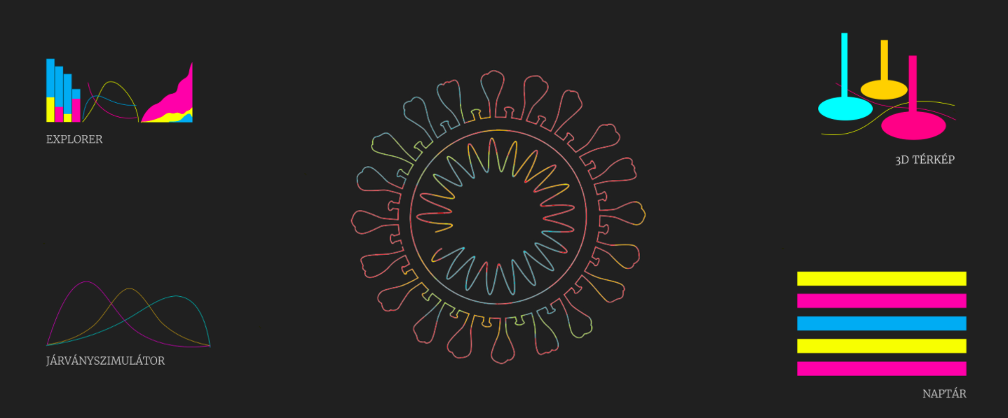
- It was rewarding share also some unusual type of graphics. Most of our readers met first with the violin plot, the log-scale, the active growth factor and multilayer 3D map on our site. These visualizations became some kind of flagships of our project, and the readers totally understood how to read them.
- We were the first in Hungary who came up with publicly available scientific mathematical modelling on the Covid-19 pandemic, and we were the only ones who created a scientific Covid-19 simulator. We also gave – in collaboration with Hungarian visualization startup Vizzu – the readers an interactive data explorer and chart application. Using the application the readers could make more than 100 charts from the Hungarian data.
- We were totally transparent and accountable. We shared our collected, processed data and secondary statistics with the public. Every change on our site was marked and enlisted, and we applied time-stamp on our site and graphs. We answered almost all the hundreds of e-mails, comments and messages.
New features: Interactive Epidemic Simulator and 3D Epidemic Map added to Coronamonitor
With the Epidemic Simulator, you can model different scenarios yourself by setting more than 10 parameters. On the three-dimensional map you can view and analyze the national distribution of the epidemic and settlement-level data. The new graph showing the active growth factor gives an idea of the slowing pace of the epidemic.
Our site and data was quoted and used by dozens of other sites and projects. Our data was used for scientific publications, articles and projects. (see here, here, here, here, here or here). And we saw from the user analytics that many of our readers came from hospitals, health institutions and state institutions
The project was also reported by the largest television station RTL Klub, by the daily newspaper Népszava, local news site Szabad Pécs. We presented our project at Corvinus University, Kürt Academy and at the Budapest BI Meetup.
As the pandemic slowly tailed away (at least in Hungary), the interest toward the Koronamonitor also faded. From 1st June we update the site on a weekly basis.
KORONAMONITOR – Grafikonok és térképek a koronavírus magyarországi helyzetéről
Written by Attila Bátorfy, the Hungarian version of this article is available here.
Share:
Your support matters. Your donation helps us to uncover the truth.
- PayPal
- Bank transfer
- Patreon
- Benevity
Support our work with a PayPal donation to the Átlátszónet Foundation! Thank you.
Support our work by bank transfer to the account of the Átlátszónet Foundation. Please add in the comments: “Donation”
Beneficiary: Átlátszónet Alapítvány, bank name and address: Raiffeisen Bank, H-1054 Budapest, Akadémia utca 6.
EUR: IBAN HU36 1201 1265 0142 5189 0040 0002
USD: IBAN HU36 1201 1265 0142 5189 0050 0009
HUF: IBAN HU78 1201 1265 0142 5189 0030 0005
SWIFT: UBRTHUHB
Be a follower on Patreon
Support us on Benevity!