New features: Interactive Epidemic Simulator and 3D Epidemic Map added to Coronamonitor

With the Epidemic Simulator, you can model different scenarios yourself by setting more than 10 parameters. On the three-dimensional map you can view and analyze the national distribution of the epidemic and settlement-level data. The new graph showing the active growth factor gives an idea of the slowing pace of the epidemic.

Data journalism section Atlo of Atlatszo launched a subpage dedicated to daily statistical updates, graphs and maps of the current status of the coronavirus outbreak in Hungary in March. The site provides data and visualisation of changes in the number of registered coronavirus cases, tested, isolated, healed and deceased patients in Hungary, a mathematical prediction model of the spread of the illness, and maps of the known cases.
Coronamonitor: we publish daily stats and visualisations on the virus outbreak in Hungary
Data journalism section Atlo of Atlatszo launched a subpage dedicated to daily statistical updates, graphs and maps of the current status of the coronavirus outbreak in Hungary.
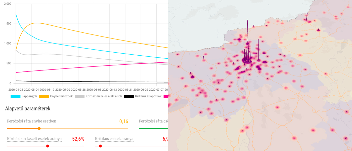
New feature: Epidemic Simulator
The software simulates the domestic course outcomes of the coronavirus. It is a version of the classic SEIR (susceptible-exposed-infected-removed) model with several other parameterization options. By default, the graph shows the current forecast calculated on the basis of known data.
A total of twelve parameters can be set as desired, the graph is adjusted accordingly, and the simulation recalculates, among other things, the expected time of the peak and the number of intensive beds required.
By clicking on each element of the color legend, you can set filters or switch the graph to a logarithmic scale for better visibility of the graphs and better comparability of propagation dynamics. You can read a lot about the methodology behind the simulation, the mathematical model and the scientific literature, as well as the explanation of the concepts below the graph.
KORONASZIMULÁTOR – Állítsd be te a feltételeket, hogy megnézd, hogyan terjed a járvány!
New feature: 3D Epidemic Map
To better understand the distribution of the epidemic, we created a heat map of the spatial distribution of cases that have become known so far. According to reports from mayors and municipalities, as well as press releases, we have location data on 70 percent of registered infected patients.
On the heat map, the confluence and intensity of the points show the settlement density, and the size of the columns shows the number of known infected individuals. On the map, county data is dimmed on a separate layer, with darker purple for more and yellow for less infected people in each county.
Highways and major roads are also shown on the map. Based on this, it can be seen that the appearance of the virus may have to do something with whether it is easier to reach the settlement on a highway or main road, and commuting, settlement density and population density also seem to be factors.
KORONATÉRKÉP – Három dimenziós hőtérkép a koronavírus-járvány magyarországi települési adataiból
New feature: Active growth factor
The good news is that the growth dynamics of the number of active infected people is slowing. To illustrate this, we also introduced a new graph which shows the change in the so-called growth factor number, which is obtained by dividing the average of the new cases of the previous five days by the average of the new cases of the previous five days before that. If this ratio is above 1, the dynamics increases, if it is below 1, it decreases. Additional graphs and maps are available on the CoronaMonitor main page, which is updated daily.
KORONAMONITOR – Naponta többször frissülő grafikonok és térképek a koronavírus magyarországi helyzetéről
Written by Attila Bátorfy. The more detailed Hungarian version of this article is available here.
Share:
Your support matters. Your donation helps us to uncover the truth.
- PayPal
- Bank transfer
- Patreon
- Benevity
Support our work with a PayPal donation to the Átlátszónet Foundation! Thank you.
Support our work by bank transfer to the account of the Átlátszónet Foundation. Please add in the comments: “Donation”
Beneficiary: Átlátszónet Alapítvány, bank name and address: Raiffeisen Bank, H-1054 Budapest, Akadémia utca 6.
EUR: IBAN HU36 1201 1265 0142 5189 0040 0002
USD: IBAN HU36 1201 1265 0142 5189 0050 0009
HUF: IBAN HU78 1201 1265 0142 5189 0030 0005
SWIFT: UBRTHUHB
Be a follower on Patreon
Support us on Benevity!